
See it work
The chart is the destination. The conversation is the difference.
A real exchange with the generator — synthetic data, five schools, eight quarters, and one question: did our attendance intervention at Lincoln HS actually work?
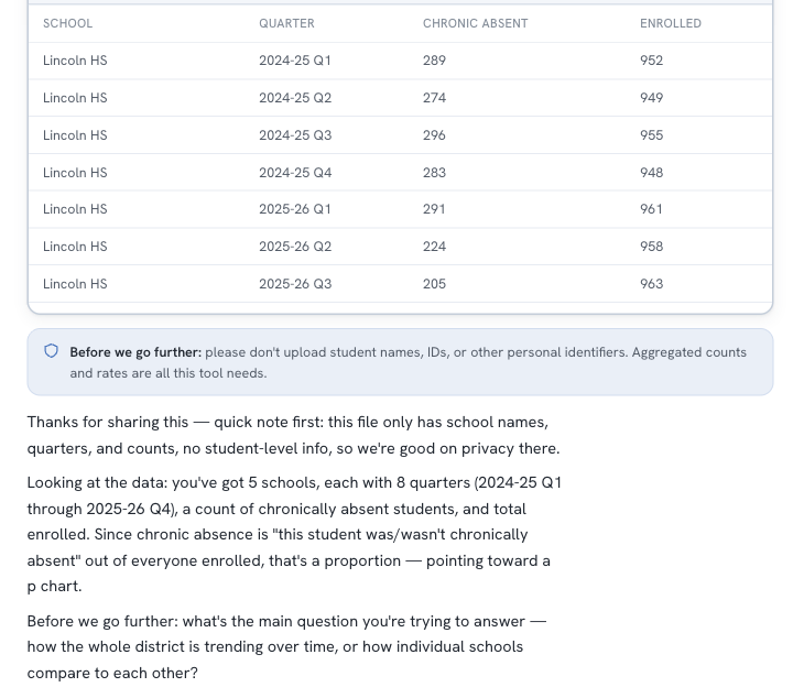
It asks before it assumes — starting with privacy
The first thing it did with this file: confirm there's no student-level data, read the structure back in plain language, and ask what question the chart should answer — track the district over time, or compare schools?
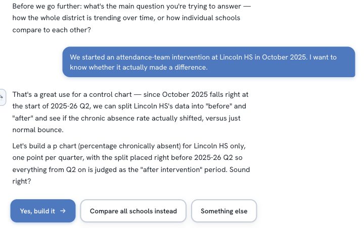
It proposes a plan — and confirms before drawing
It heard “did the intervention work,” translated it into a before/after chart with the split placed where the intervention started, explained why — and asked for a go-ahead before building anything.
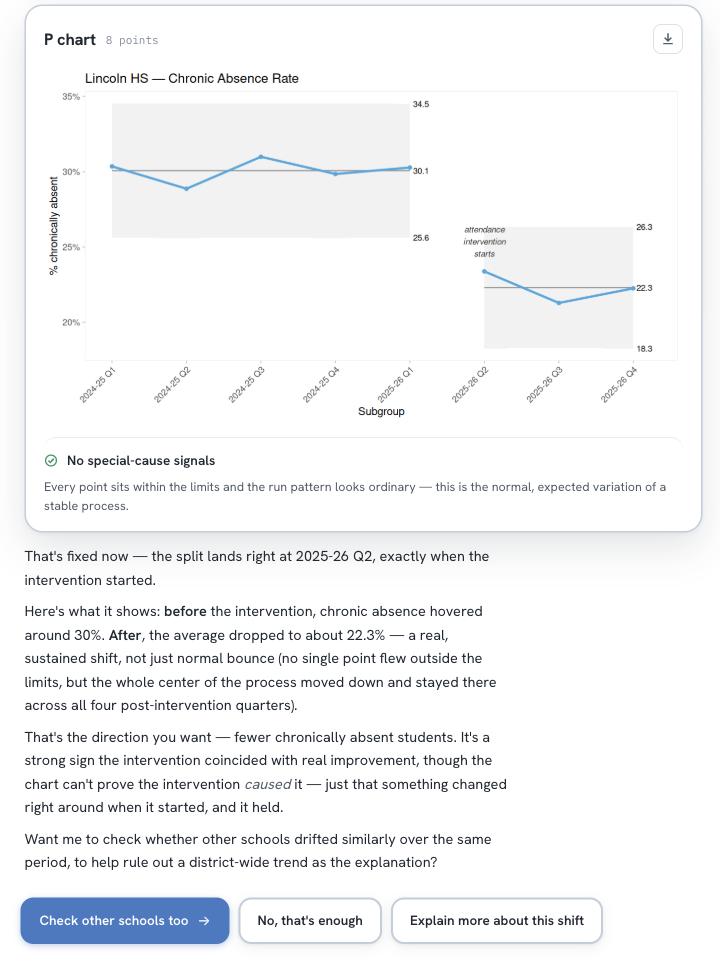
It answers the question — and says what the chart can't prove
The verdict: a real, sustained shift — chronic absence dropped from about 30% to 22% and stayed there. And the honest caveat: a chart shows that something changed when the intervention started, not that the intervention caused it. Then it offers to rule out a district-wide trend.
Ready when you are
Your data is ready to teach you something.
Bring a spreadsheet and a question. The generator handles the statistics.